Limitless Contractor Marketing

Brand & Press Kit

Logo, color palette, typography, voice, and usage guidelines for Limitless Contractor Marketing. Downloadable assets for partners, press, and integrators.
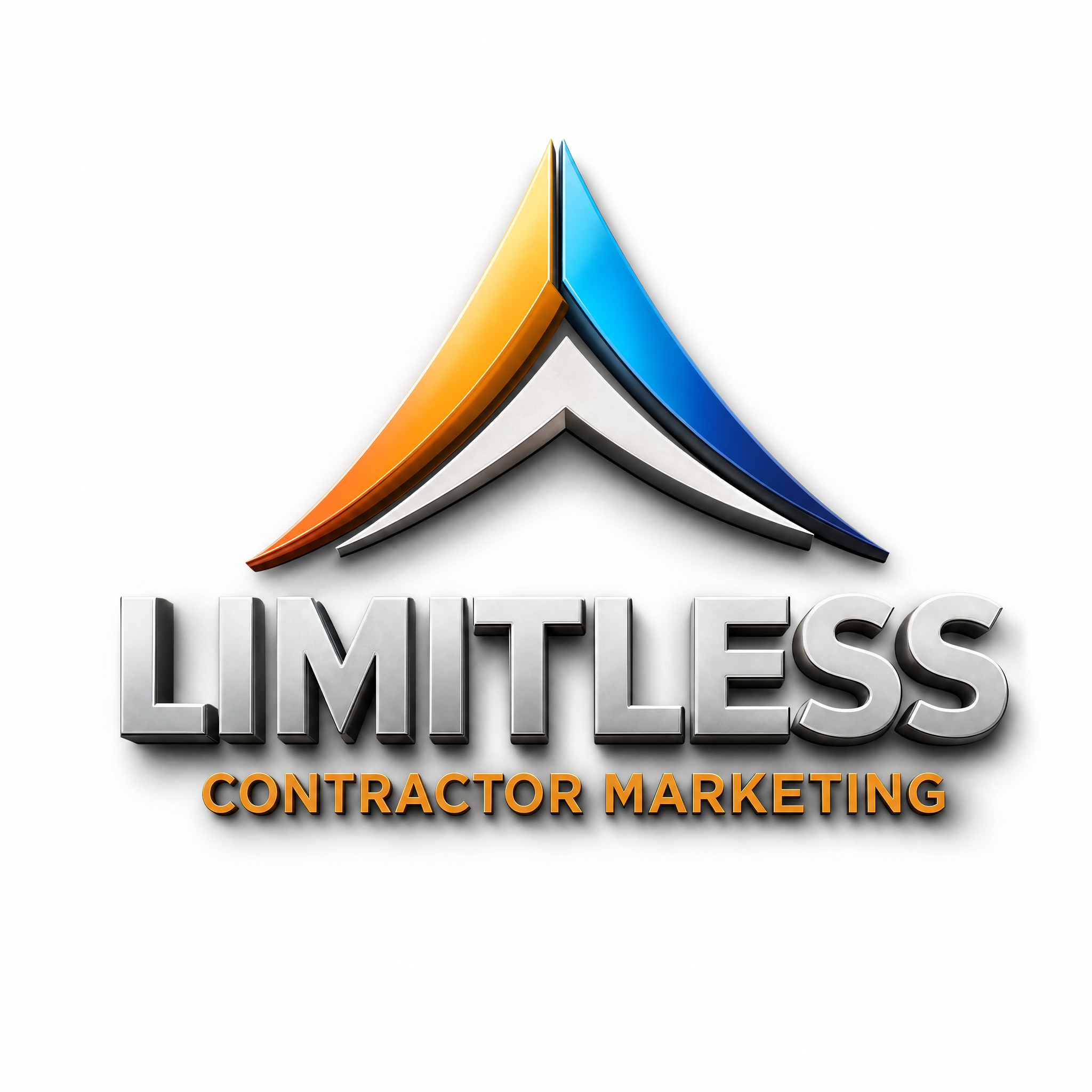
Logo

The 3D chrome wordmark with orange-and-blue mountain peak. Use on light surfaces. Transparent-background variants are not currently available — request specific formats via info@limitlesscontractormarketing.com.

Brand colors

The palette is warm-leaning by default. Cool tones are reserved for accents that benefit from contrast against the warm baseline.

#2D5BD7
Limitless Blue
Primary — links, focus rings, key CTAs
oklch(0.62 0.22 252)
#E08540
Limitless Orange
Accent — highlights, badges, warm callouts
oklch(0.72 0.18 55)
#1B2333
Deep Navy
Foreground — body text, headings
oklch(0.18 0.012 248)
#FCFCFD
Off-White
Background — page surfaces
oklch(0.99 0.005 248)

Typography

Two faces. One for headings and display, one for body and UI.

Display / Headings
Bricolage Grotesque

Used for h1 / h2 / h3 with font-heading. Loaded via Google Fonts with display: swap.

Body / UI
Inter

Default sans-serif applied via the body --font-inter variable. Used for paragraph text, buttons, navigation, form inputs, and most UI surfaces.

Voice & tone

Confident, direct, slightly bold, with calm professional polish. Stripe meets Basecamp meets Patagonia. Industry-specific expertise without corporate stiffness. Premium feel without pretension.
Direct

Short sentences over long ones. Plain English over jargon. Specific numbers over vague claims.

Confident

State what is true rather than hedging. Make recommendations, not menus of options.

Calm

Avoid hype, exclamation points, and pressure tactics. Premium-feeling restraint over loud salesmanship.

Logo usage guidelines

Do
  • Use the logo on light or warm-neutral backgrounds for best contrast.
  • Maintain at least one logo-height of clear space on every side.
  • Use the full-color version whenever possible — the chrome wordmark and orange/blue mountain are part of the brand identity.
  • Display at minimum 56px height on screen, 0.5 inch in print.
Don't
  • Don't stretch, skew, rotate, or apply visual effects to the logo.
  • Don't recolor the logo or apply tint overlays.
  • Don't place on busy photographic backgrounds without a solid container.
  • Don't substitute or modify the typography in the wordmark.
  • Don't use the logo to imply endorsement without written permission.

Press inquiries

For interviews, partnership questions, or anything that doesn't fit the contact form, reach the team directly.